
EMERSON
IN CHILE
CREATIVE DIRECTION _ DESIGN _ MOTION DIRECTION _ MOTION DESIGN
Collage-style video that integrates student testimonials to promote a study abroad course for Emerson College.
EMERSON IN CHILE EMERSON IN CHILE EMERSON IN CHILE EMERSON IN CHILE EMERSON IN CHILE EMERSON IN CHILE EMERSON IN CHILE EMERSON IN CHILE EMERSON IN CHILE EMERSON IN CHILE EMERSON IN CHILE EMERSON IN CHILE EMERSON IN CHILE EMERSON IN CHILE EMERSON IN CHILE
01
Letting assets shape the process
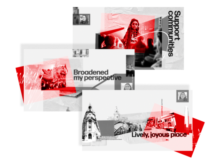
Working with a large library of user generated content initially seemed like it may be challenging. However, I quickly realized that the authenticity of these assets, many of which captured by the students themselves, would help to create a much more direct connection to the target audience which tends to disengage from overly polished ad-like content.
While the stakeholders wanted to incorporate student testimonials, they also wanted it to be more visually interesting than just a slideshow of photos. The challenge early in the creative process was how to visually find that perfect balance between feeling “real” and “authentic” while still carefully crafting a story.
02
Collage-style animations
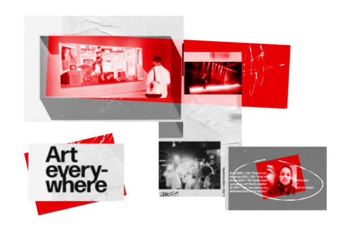
While reviewing the assets to find clues about a potential direction for the visuals, what stood out was the grit and texture of the city in contrast with the minimalist visuals of the art world. I imagined a wall plastered with art and event posters outside of a venue as a succinct representation of this idea. A little more design research with mood boards and feedback from the stakeholder confirmed that a texture-heavy collage style with a dash of bright colors would feel like the perfect visual representation of the course.
Leaning into the collage look had another important advantage. It covered up some of the lack of polish of some of the assets and even invited it. Graininess, grit and imperfections become assets rather than something that needed to be covered up.
03
Finding depth in collage

While reviewing other collage videos, I noticed that many videos rely on drop shadows to add depth. Playing around with this approach, it felt too flat for me. In addition, the stakeholders wanted the video to highlight how students are immersed in arts, culture, and education. Immersion needed more than drop shadows.
Revisiting some of the early designs, I noticed that the most effective collages were ones that embraced the natural depth of an image. Leaning into both visible and implied depth like the shape of a room or street, I decided to artificially extend those spaces adding brightly colored faux 3D elements. This not only helped to give the video depth, it also gave it a distinct visual style that was particularly versatile when designing the motion.
04
Gritty motion that works
Wanting to reflect the grittiness of the visuals in the motion design, I started by lowering the frame rate of the video. This gives the motion a less polished feel, more suitable for a collage. Similarly, rather than smoothly animating textures, they skip and move around unexpectedly. This mimics the college students’ movements through an unfamiliar city, an experience that is overwhelming and chaotic yet also beautiful and ultimately memorable.
If gritty motion, ends up a bit chaotic like life, stillness takes on a new meaning. In this case, the text is mostly static and becomes an anchor. The text summarizes the underlying theme of each section so the viewer can quickly connect the visuals and the voice over with the overall message.
EMERSON IN CHILE EMERSON IN CHILE EMERSON IN CHILE EMERSON IN CHILE EMERSON IN CHILE EMERSON IN CHILE EMERSON IN CHILE EMERSON IN CHILE EMERSON IN CHILE EMERSON IN CHILE EMERSON IN CHILE EMERSON IN CHILE EMERSON IN CHILE EMERSON IN CHILE EMERSON IN CHILE