
GIRL by IDER
CREATIVE DIRECTION _ MOTION DIRECTION _ MOTION DESIGN
Fast-paced typography animation with minimalist design for a lyric video teaser.
GIRL BY IDER GIRL BY IDER GIRL BY IDER GIRL BY IDER GIRL BY IDER GIRL BY IDER GIRL BY IDER GIRL BY IDER GIRL BY IDER GIRL BY IDER GIRL BY IDER GIRL BY IDER GIRL BY IDER GIRL BY IDER GIRL BY IDER GIRL BY IDER GIRL BY IDER GIRL BY IDER
01
A motion (& sound) driven approach
The most common approach to motion design remains one that starts with static designs which are then developed into motion. If a project is motion-centric, however, this approach can be limiting.
Neither motion nor music can be static. So for a project like GIRL, jumping into motion tests first and then refining and expanding designs based on these tests made more sense than trying to first develop visuals for the entire sequence.
While jumping into motion right at the beginning can be daunting, even small elements and movements can quickly help to define a piece. For example, the drop of the beat paired with the drop of the word GIRL was an early discovery that was simple but effective and helped to define transitions and many other animations throughout the video.
02
Restraint and complexity
Restraint can be difficult in design. “Is this enough? Should I add something more to justify my time spent on this? It can’t just be a single word, right?”
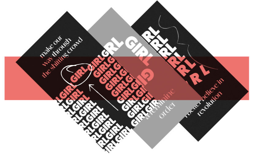
For a song that contrasts the complexity of femininity with restrained electronic beats, the design naturally needed to mirror this same tension. After some experimentation, nothing proved to be as effective as literally putting GIRL at the center of the visuals. Every visual element (other than the lyrics) is created from the world GIRL.
I wondered briefly, given the song’s fast pace and varied lyrics whether I could come up with enough designs from a single word to carry this through the entire teaser but my worries were unfounded. Instead what I discovered was the power of typography in motion. The seemingly endless ways to manipulate typography to create something new and something different, even when all you have is a four letter word and 3 different colors.
03
Break the rules once in a while
This video was one the smoothest, fastest video I’ve ever created. I believe this speaks to the power of a strong metaphor and a clear concept that creates boundaries and guidelines for creativity to blossom within.
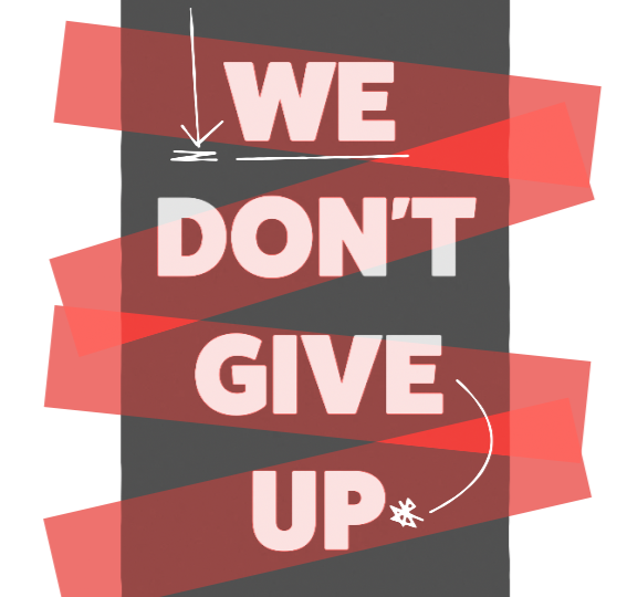
If you’ve carefully watched the video, you may notice a moment when the world GIRL is not on screen for a few seconds. It is when the phrase WE DON’T GIVE UP flashes on screen. Though, truthfully, I made this design choice without being fully conscious of it at the time, it stood out to me later as a choice that felt powerful and right.
It was a valuable lesson on the impact of carefully breaking rules. That choosing to pop out of a tightly constructed grid for a brief moment can grab the viewers attention and highlight a core message without needing to resort to bells and whistles.
GIRL BY IDER GIRL BY IDER GIRL BY IDER GIRL BY IDER GIRL BY IDER GIRL BY IDER GIRL BY IDER GIRL BY IDER GIRL BY IDER GIRL BY IDER GIRL BY IDER GIRL BY IDER GIRL BY IDER GIRL BY IDER GIRL BY IDER GIRL BY IDER GIRL BY IDER GIRL BY IDER