
UI Mockup
Animations
CREATIVE DIRECTION _ MOTION DIRECTION _ MOTION DESIGN
Originally part of a pitch for a potential client, this project was repurposed into a playful set of UI-driven tutorials.
UX MOCKUP ANIMATIONS UX MOCKUP ANIMATIONS UX MOCKUP ANIMATIONS UX MOCKUP ANIMATIONS UX MOCKUP ANIMATIONS UX MOCKUP ANIMATIONS UX MOCKUP ANIMATIONS UX MOCKUP ANIMATIONS UX MOCKUP ANIMATIONS UX MOCKUP ANIMATIONS UX MOCKUP ANIMATIONS
01
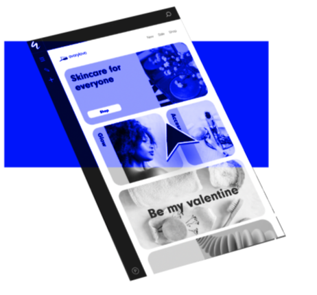
The challenge of mockups
An important part of my job is to make flat utilitarian mockups into the star of any video. Simplification, abstraction, depth of field, and blurring are some strategies used to bring life and variety to UI mockup focused content.
For the best outcomes, design choices need to be centered on the purpose of the video. Support content, for example, should reflect the UI precisely, whereas promotional content can dip more into abstraction.
For this set of videos, I leaned on the conventions of short-form, social media-style tutorial content which conveys general strategy and technique rather than step-by-step instructions. This allows the videos to move at a faster pace, suitable for platforms like TikTok and Instagram.
02
Bringing focus through isolating elements
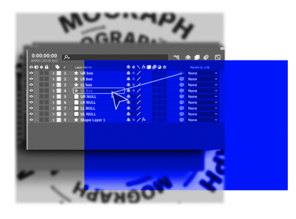
Most UI design mockups are too large and complex to feature entirely, especially when working with vertical formats.
For a complex tool like After Effects, with dozens of menus and buttons, carefully isolating elements is critical. Show too much context, the viewer can’t focus and the video needs to slow down. Show too little context, the viewer can’t orient themselves.
Relying on the direction of motion is an important strategy to help guide the viewer. For example, showing a cursor moving down a menu until they reach the right item, cues the viewer to look for elements at the top that unfurl vertically.
03
Abstraction
when necessary
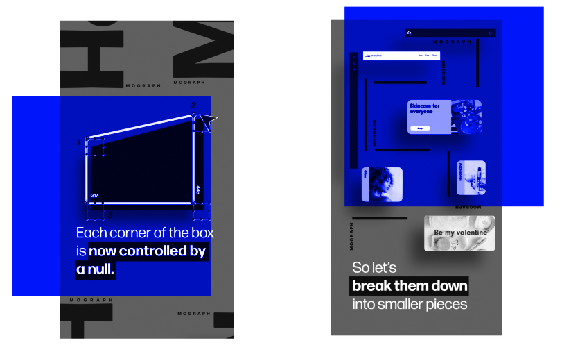
Clicking buttons and making selections usually leads to some kind of corresponding change. This change may be visually obvious (changing a color of a layer) or be invisible to the user (changing settings of a tracking code). These moments offer a chance to break from the potential monotony of living exclusively in UI-landia and to playfully explore core functionality through visual metaphors.
I design these moments to be dynamic and playful while also ensuring that they fit seamlessly into the rest of the video. Leaning on (or creating) strong motion and visual branding helps to make these moments feel comfortably within the overall brand experience.
For example, reusing the same fake mockup website and the same style of typography-driven secondary animation, helps the videos feel unified both across different scenes as well as across different videos in the series.
04
Lean into
motion principles
While classic animation principles can feel too cartoonish for serious brands, they still offer us many important lessons for mockup-centric animations especially when we can connect our choices to the overall message of the video.
For this video, I knew that the quick pace of social media would require me to cut quickly between scenes. To make these transitions feel smoother, I heavily relied on match cuts and secondary animation in the form of background typography elements. These techniques help guide the eye in the right direction and reinforce the overall thrust of the transition.
The fluidity of the movements functions as a metaphor for smoother and easier animations which reflects the content of the video itself. In my experience, the design choices that allow the visuals and messaging to work in tandem lead to the strongest content.
UX MOCKUP ANIMATIONS UX MOCKUP ANIMATIONS UX MOCKUP ANIMATIONS UX MOCKUP ANIMATIONS UX MOCKUP ANIMATIONS UX MOCKUP ANIMATIONS UX MOCKUP ANIMATIONS UX MOCKUP ANIMATIONS UX MOCKUP ANIMATIONS UX MOCKUP ANIMATIONS UX MOCKUP ANIMATIONS